Build an Accessible React Color Picker: A Practical Guide
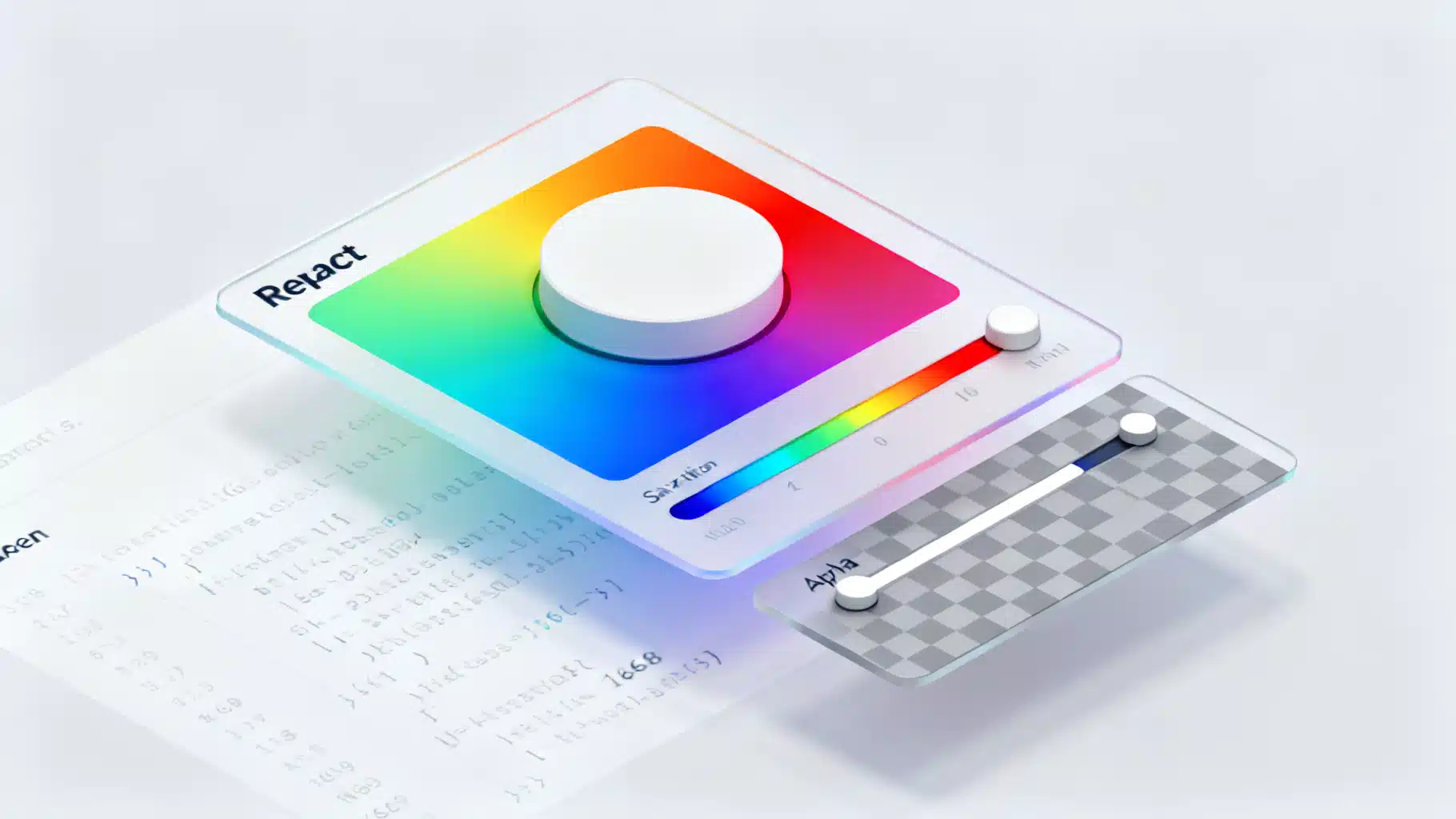
Build a fast, accessible React color picker from scratch: HSV logic, sliders, popover, keyboard/mouse support, CSS variables, tests, and library options.
Build accessible, high-performance React tooltip and popover components with Floating UI. Includes TypeScript examples, a11y guidance, and testing tips.
Build a flexible, accessible React timeline component with TypeScript—layout, theming, animation, responsiveness, virtualization, and tests.
Build an accessible, animated React accordion: ARIA semantics, keyboard support, headless API, smooth height transitions, tests, and performance tips.
A practical, scalable React dark–light theme system using CSS variables, design tokens, and SSR-safe bootstrapping—fast, accessible, and maintainable.
Build a production-ready, accessible React combobox/select with correct ARIA, keyboard support, async data, virtualization, and testing tips.